Walkable South End: What works and what doesn’t
Have you ever walked around Charlotte’s South End and wondered why some locations consistently stand out as neighborhood gathering places while other spots are just dull and uninviting?
It turns out that most great places have at least one thing in common: They’re built on a human scale to create just the right amount of interaction between public and private space.
Local urban designer and architect David Walters recently led a short Jane’s Walk through the South End neighborhood near the East/West light rail station. Named for city planning advocate Jane Jacobs, these free community-led walking tours occur in cities and towns throughout the world.
The goal of the walk was to visit examples of urban design at its best and worst.
Our first stop was Big Ben’s Pub. Despite being a mostly indoor venue, the pub wisely created a dining area on the back deck where patrons can interact with the public space.
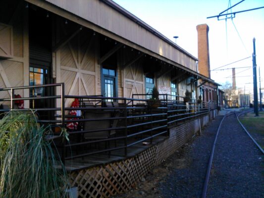
Outdoor decks and patios invite pedestrians to linger and interact with each other.
We walked farther north and soon encountered a less glowing specimen, a small shopping and dining area where blank brick walls and trash bins are all that greets pedestrians and bicyclists on the rail trail. In the shopping center’s defense, the buildings were there long before the light rail and rail trail were built. There are some wonderful small retail shops and restaurants here, but they face either South Boulevard or the parking lot rather than the rail trail.
Some buildings, like the one that holds Big Ben’s, are better suited for retrofitting than others. Examples like this really underscore why it’s important to have good zoning in place before we build transit, bike, and pedestrian infrastructure.
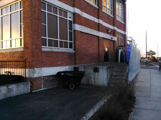
Walking past trash bins and blank walls just isn’t a great experience for pedestrians.
Then we moved on to look at some residential examples. We checked out an apartment building that creates a good experience for both residents and people passing through the area. It features small hedges that create a soft transition between the public and private space, while also shielding the metal fence behind them. Note the small front porches with stairs down to the rail trail, lamp posts, and an architectural style that blends nicely into the neighborhood:
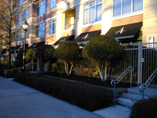
An apartment building with a good public-private interface.
There’s nothing exceptional about this, but it’s done well. Walters emphasized that designing a decent public-private interface for a building isn’t rocket science. “It’s just not that hard to get it right.”
A Room Without A View
As Walters explained, it should be a given that developers incorporate proper basic urban design principles into their projects. “Fronts should face fronts, and backs should face backs!” Sounds easy, doesn’t it? But as we soon discovered, a lot can go wrong when a city’s zoning code doesn’t account for how adjoining parcels of land are developed to complement each other.
It’s almost comical, until you’re the resident whose balcony suddenly faces a brick wall. We found this little gem near Kingston and Camden:
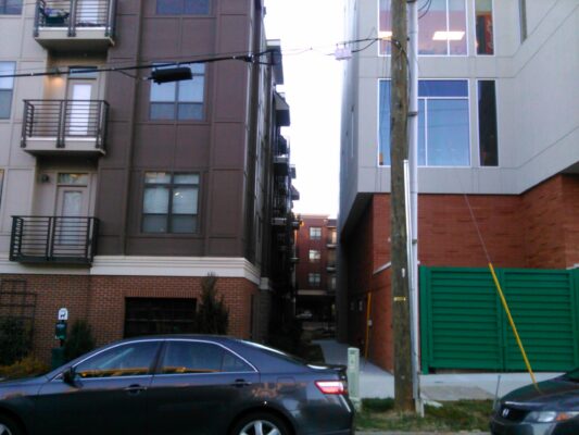
Front of apartment building + back of office building = FAIL!
The Gold Standard: Ground-level Retail
We’ll end on a positive note by sharing an example of new construction that creates a genuinely amazing experience for pedestrians.
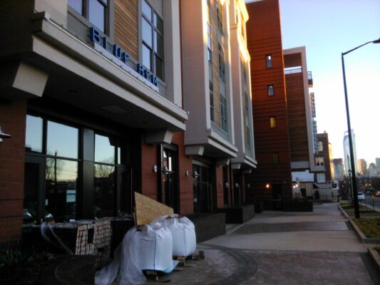
This new development a bit further north in South End has several stories of apartments above ground-level retail. Look at those beautiful high windows and the wide sidewalk! This creates a much more interesting experience for pedestrians than endless blocks of identical ground-level residential. All those future shops and restaurants will invite people to get out of their cars and explore the area on bike or on foot after hopping off the light rail.
We’re spending over a billion dollars on the LYNX Blue Line extension light rail. Shouldn’t we, the tax-paying public, demand the best possible development in the areas adjacent and near this rail line?
Our city has a golden opportunity to learn from some of the missteps that happened as South End developed so rapidly after the first segment of the light rail. Let’s not make the same errors in northeast Charlotte.
It’s time for a zoning ordinance that requires excellent use of the interface between public and private spaces!
Thanks for reading!
As a nonprofit, community support is essential for us to keep doing what we do — including providing free articles like this. If you found this article helpful, please consider supporting Sustain Charlotte.
Want to stay in the loop? Subscribe to our weekly newsletter and follow us on Instagram, Facebook, and Twitter.
